 |
| photo by amberinblunderland.blogspot.com |
I've worked directly with printers on everything from full-color magazines to posters and brochures (as a managing editor and a graphic designer). One important lesson I learned is that every set of equipment has its own vagaries in terms of how it lays ink on the page and how it handles paper. It's almost impossible to have quality control over images when you can't work directly with vendors. But you can get better results if you make design decisions that take certain issues into account.
Below are a few key concepts you need to know about one-color printing (black ink on pale paper) so you (or any designer you hire) can create designs that consistently reproduce well in a print-on-demand environment.
dot gain
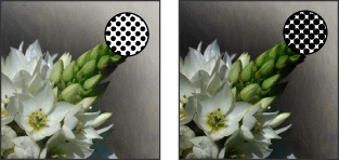
Every printed image is made up of a series of ink droplets. Some machinery has the tendency to be overwet in feeding ink, so the dots can spread (or the dot pattern can enlarge going from computer to press). That's called "dot gain" by the industry pros. Other machinery can be a little stingy with ink, resulting in "dot loss," or a less intense, somewhat washed out look. |
| Dot gain illustrated (image: underwaterphotography.com) |
When dealing with solid blacks, dot gain is often not noticeable to an untrained eye. And dot loss is something most printers vigilantly check for.
But when it comes to what are called grayscale images--like black and white photographs, pencil drawings, or pen-and-ink illustration that has shading created with pointillism or fine cross-hatching--dot gain or loss can seriously mar the final printed product.
Bold line art will hold up better across a variety of machines than grayscale images. Thick lines and less detail should yield the very best results.
If you're working with clip art, you want an EPS file or what's called a "vector graphic," rather than a TIFF (tagged image file format), because it won't pixelate if you enlarge it.
Any hand drawing should be done on the smoothest, whitest paper you can buy. When scanning the image, follow these helpful tips.
bleed tolerance
A "bleed" in printing is an image that extends off the edge of the page. CreateSpace allows you to have interior images that bleed and gives very specific instructions for doing that, which I quote below:Does your book contain images?
If you want your images to bleed to the edges of your book, ensure that they extend at least .125" beyond the final trim size from the top, bottom and outer edges and submit your PDF .25" higher and .125" wider than your selected trim size to accommodate the full bleed area.
Keep in mind all live elements must be at least .25" away from the trim lines, so if your file is formatted to be full bleed all live elements should be .375" away from the edge of the page.
© CreateSpace, 2014
But here's the rub: not every copy of your book will necessarily print on the same press; print on demand means it typically prints closest to where it will ship. Some presses have a marginally different "tolerance" (an "allowed quantitative difference" aka wiggle room, slip, what have you; see an example here). CreateSpace tries to account for this by having relatively large bleed areas and trim tolerances (.25 compared to .125 of most printers). That way you'll never end up with an image that floats with white space around it when it's supposed to hang off the edge of the page. But you could end up having an image trimmed more severely than you anticipated. |
| Bleed tolerance example (image by 48HourPrint.com) |
All that to say, be mindful that any image that bleeds could cut off just a bit differently than it looks like it will in your page layout software. Make sure detailed bits, like lettering, are well inside the safety area.
What do you think of adding illustrations to books? Too scary or worth the effort?
Categories: art, design, dot gain, graphic design, illustration, Indie publishing, print production, print-on-demand


Definitely something I'm going to have to try someday.
ReplyDeleteCool! Glad this helped you feel empowered.
DeleteWow, I'd never even thought of this side of indie publishing, adding illustrations. I just figured it wasn't really an option- I should have known better than that though! Very cool, thanks for breaking it down, Laurel.
ReplyDeleteI imagine not all print-on-demand vendors are willing to accommodate interior art, so anyone considering it should definitely research before committing to one. But yes, if files are prepared correctly, interior art is quite do-able.
DeleteI just experimented with adding images in my latest book. I had a friend create an image for the chapter headings, and another for scene changes. The former came out clear, but the latter is a tad blurry if you look hard enough. I'll be working on ways to improve it for a re-release.
ReplyDelete